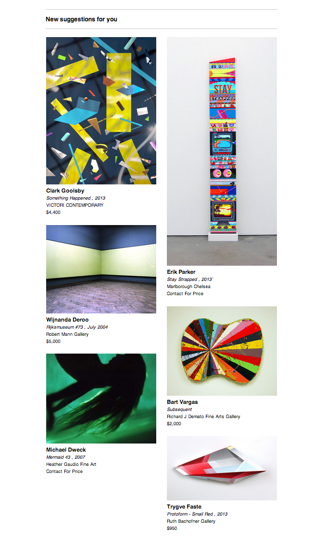
Something we’d like to do is email our users some suggested artworks as part of their personalized emails. The layout of those suggestions should look something like our newly re-designed Browse page, with a ‘salon’ style layout. Here’s some simple Ruby code that can group artworks into columns for you, that can then be directly rendered in an email (via Haml, Mustache, Jade, or your templating language of choice.)
The code
First let’s look at the code, and then I’ll describe it:
module ArtworkColumns
  # Return an array of artworks grouped together in sub arrays by being added to the shortest 'column'
  # based on a fixed width and aspect ratios.
  #
  # @param {Array} artworks The array of artworks to group into columns
  # @param {Number} num_columns The number of columns to group them into
  # @param {Number} width The width the images will be displayed at
  #
  # @return {Array} An array of artworks grouped into sub arrays by being added to the shortest one.
  def self.artwork_columns(artworks, num_columns, width)
    artwork_cols = []

    # Initialize columns
    num_columns.times do
      artwork_cols << []
    end

    artworks.each do |artwork|
      add_to_shortest_column!(artwork_cols, artwork, width)
    end

    artwork_cols
  end

  private

  # Adds artwork to shortest column
  def self.add_to_shortest_column!(artwork_cols, artwork, width)
    min_height = column_height(artwork_cols[0], width)
    min_column_idx = 0

    artwork_cols.each_with_index do |column, idx|
      height = column_height(column, width)
      if height < min_height
        min_height = height
        min_column_idx = idx
      end
    end

    artwork_cols[min_column_idx] << artwork
  end

  # Calculate sum of heights of artworks in column
  def self.column_height(artwork_col, width)
    height = 0
    artwork_col.each do |artwork|
      if (aspect_ratio = artwork.default_image.aspect_ratio)
        height += (width / aspect_ratio).floor
      else
        height += width
      end
    end
    height
  end
The algorithm is quite simple (original JS idea and implementation courtesy of Artsy’s Gib). The inputs are fairly obvious, an array of artworks to be grouped, the number of columns to group them into, and the width of each column.
We then simply iterate over all our artworks, and add them to whichever column is shortest. This way we end up with several columns that are for the most part equally sized in height, and as they all have different aspect ratios, when they are rendered in a table, you wind up with a nice looking ‘dynamic’ layout. The height of each column is calculated as the sum of the heights of the artworks in each column. The heights are derived from the inputted widths and aspect ratios of the images.
Here’s how you might iterate over the returned column groupings and render a layout similar to the above:
- artwork_suggestions.each_with_index do |artwork_arr, idx|
  %td{ id: 'artwork-column', style: "width: 290px;padding-top:20px;text-align:left;" }
    - artwork_array.each do |artwork|
      %a{ href: "#{canonical_url}/artwork/#{artwork.slug}?#{@utm_params}" }<
        %img{ id: 'artwork', src: "#{artwork.default_image.image_url(:large)}", style: "width: 290px;" }
      %br
      <!-- additional artwork details, title, artist, etc. -->
These few lines of Ruby code have allowed us to move logic out of Haml (yuck!) and into Ruby (yay!) and allow Haml to just focus on rendering the objects passed in (certainly via loops and conditionals, etc.)
That’s all for now! In my next post I’ll talk about how I use the Presenter pattern and memoization to move even more logic out of templates (and save some database calls while we’re at it!)
Thanks again! Post any comments or tips of your own here, and follow us on Github!
Comments