We recently got a report from one of our galleries in the Los Angeles area that they weren’t showing up on our Los Angeles exhibition listings.
I fielded the report and right away confirmed: when we asked our core API for
/shows?near=<los angeles coordinates>, sure enough this gallery partner didn’t
make the cut.
Turns out they are based in Santa Monica, a separate and neighboring municipality. They must not be within the 25km radius that we use by default for these sorts of queries.
Case closed. Or so I thought.
After some back and forth with our partner I decided to investigate more thoroughly, this time using some tricks of the trade from my other life outside of Artsy.
Casting a wider net
If there was something wrong with our 25km radius query, I wanted to start by casting a wider net and visualizing the results.
I consulted our Rails application code to find the query logic in question, and then issued the same query directly to MongoDB. Something like the following query (simplified for clarity):
// a $geoWithin $center query

db.events.find({
  coordinates: {
    $geoWithin: {
      $center: [[-118.24, 34.05], 25 / 111.32],
    },
  },
})
In the query above we are asking MongoDB to give us all events within a 25km radius around the point 34.05°N, 118.24°W which we have designated as a central point within Los Angeles. For our purposes in this post we can consider “events” ≈ “exhibitions” ≈ “shows.”
We are not asking for the 25km radius directly, but rather converting it into an equivalent amount of geographic degrees by using a conversion factor of 1° ≈ 111.32 kilometers, a factor which is true at enough the equator.
I modified the above query to cast a 50km net in order to see if there were some edges cases that needed scrutiny. Taking the resulting JSON response, I fired up Placemark, my favorite new tool for wrangling geospatial data.
(Incidentally I recommend reading Tom Macwright’s recent reflection on creating Placemark as a bootstrapped indie developer.)
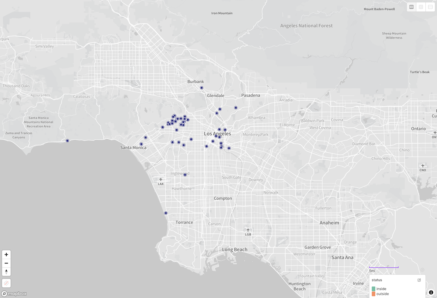
Ball of confusion
One nice feature of Placemark is that it lets us place geodesic circles on the map, that is, circles that represent a constant radius around a point, as plotted on a globe.
When I placed a 25km radius circle on the map, something stood out immediately.
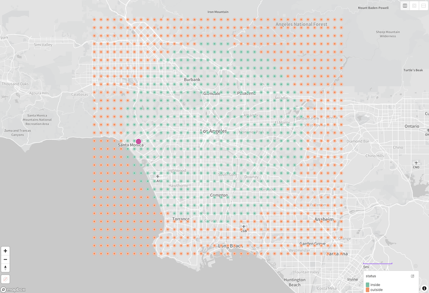
The partner in question is highlighted in pink — and is clearly within the 25km radius. What gives?
By spot-checking a few points on the map against our current geo query I found that edge cases near the top or bottom of the circle were likely to be evaluated correctly, while edges cases at the left and right were being incorrectly omitted, as our partner gallery was.
A fuller visualization of that finding would look like this:
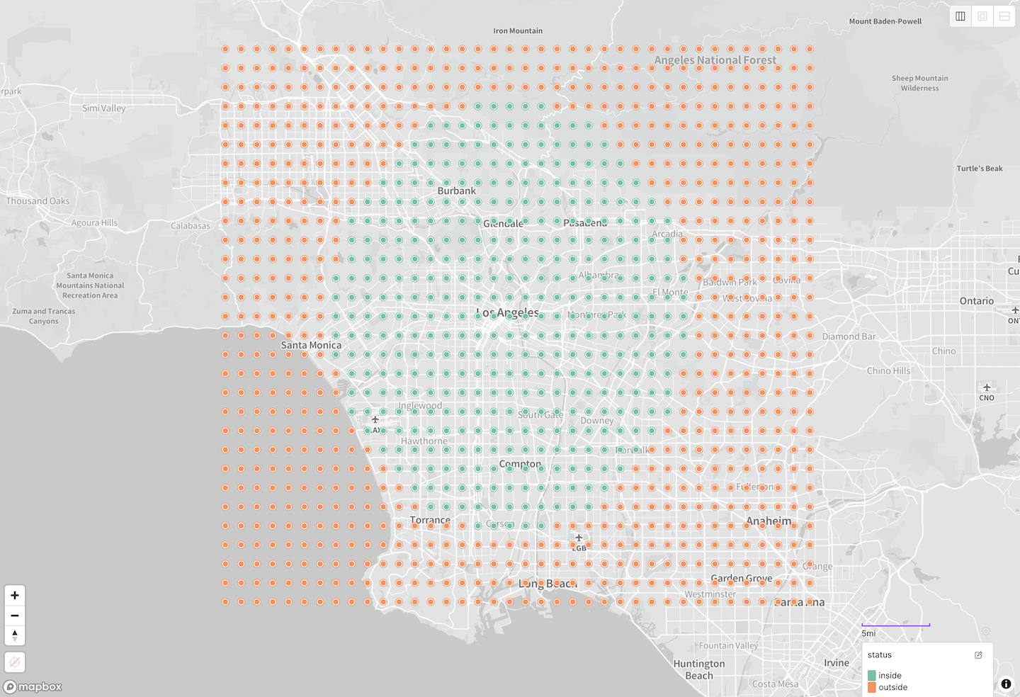
$geoWithin $center query around Los Angeles, evaluated against a grid of test points.A distinctly non-circular circle — that rung a bell.
More than one way to draw a circle on the Earth
It was at this point that I recalled the specific form of the geospatial query our code was performing, and consulted the MongoDB docs for the $geoWithin query.
Turns out that you can invoke this as a radius query in one of two ways, by specifying $center or $centerSphere.
Per the
docs
for $center, this query…
calculates distances using flat (planar) geometry
Let us pause for a moment to note that while only some maps are deceitful, all maps are untruths. In the sense that they flatten three dimensions down to two, and inevitably distort the world in the process.
The surface of a three-dimensional globe cannot be flattened down to a two-dimensional plane without some stretching or tearing, any more than an orange peel can be. The mathematical algorithms for turning those three dimensions into two are what we know as map projections. (Ah, the good old days when “dimensionality reduction” meant from three to two.)
If you do your distance calculations in such a flattened, projected coordinate
system — as the $geoWithin $center query does — then you are accepting
whatever distortions are inherent to that projection.
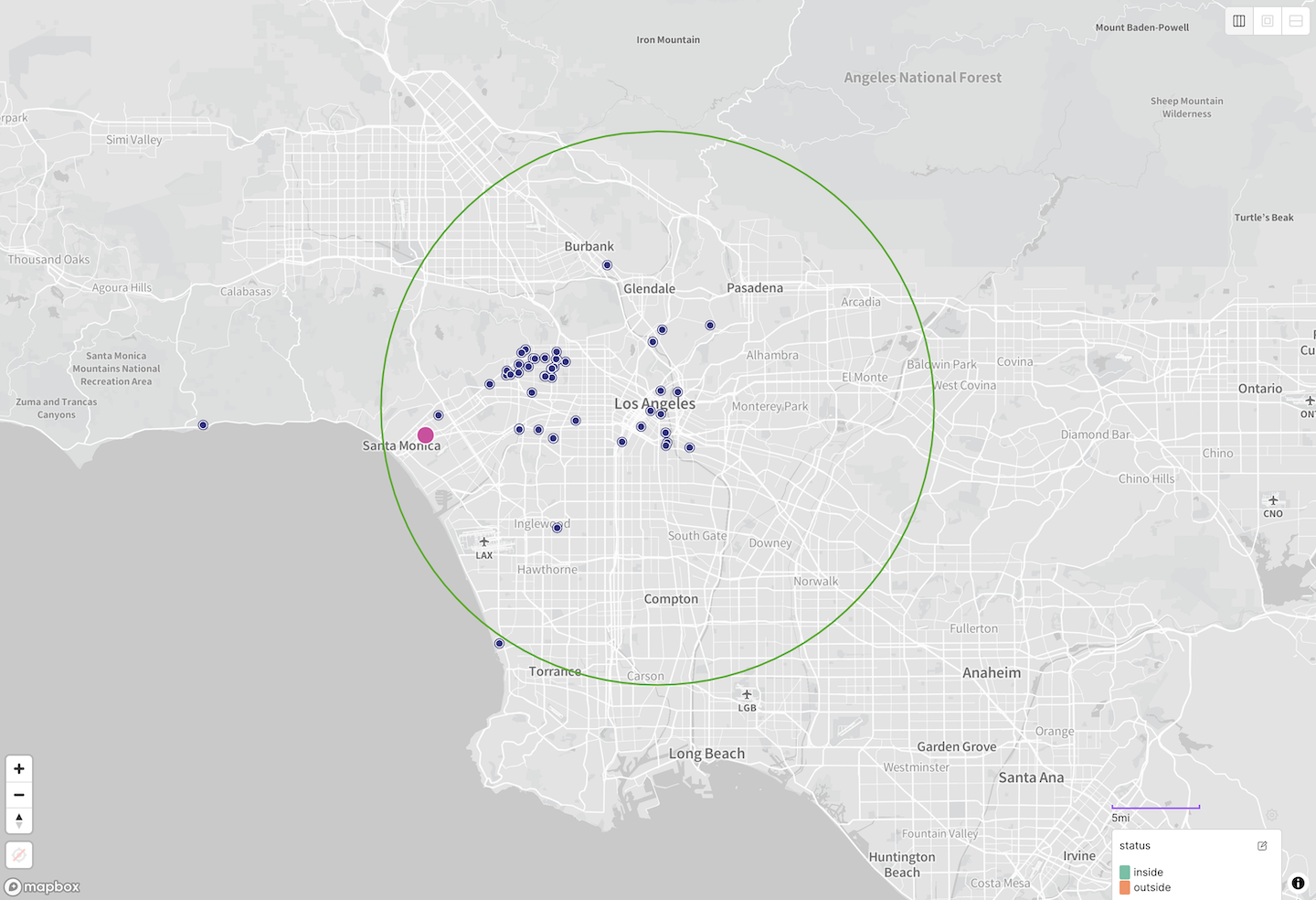
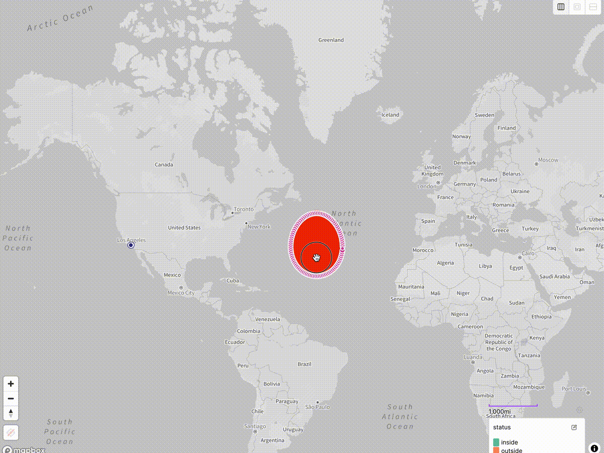
That’s the situation we were in. We thought we were catching everything inside the green circle, but in fact we were only catching everything inside the red egg:
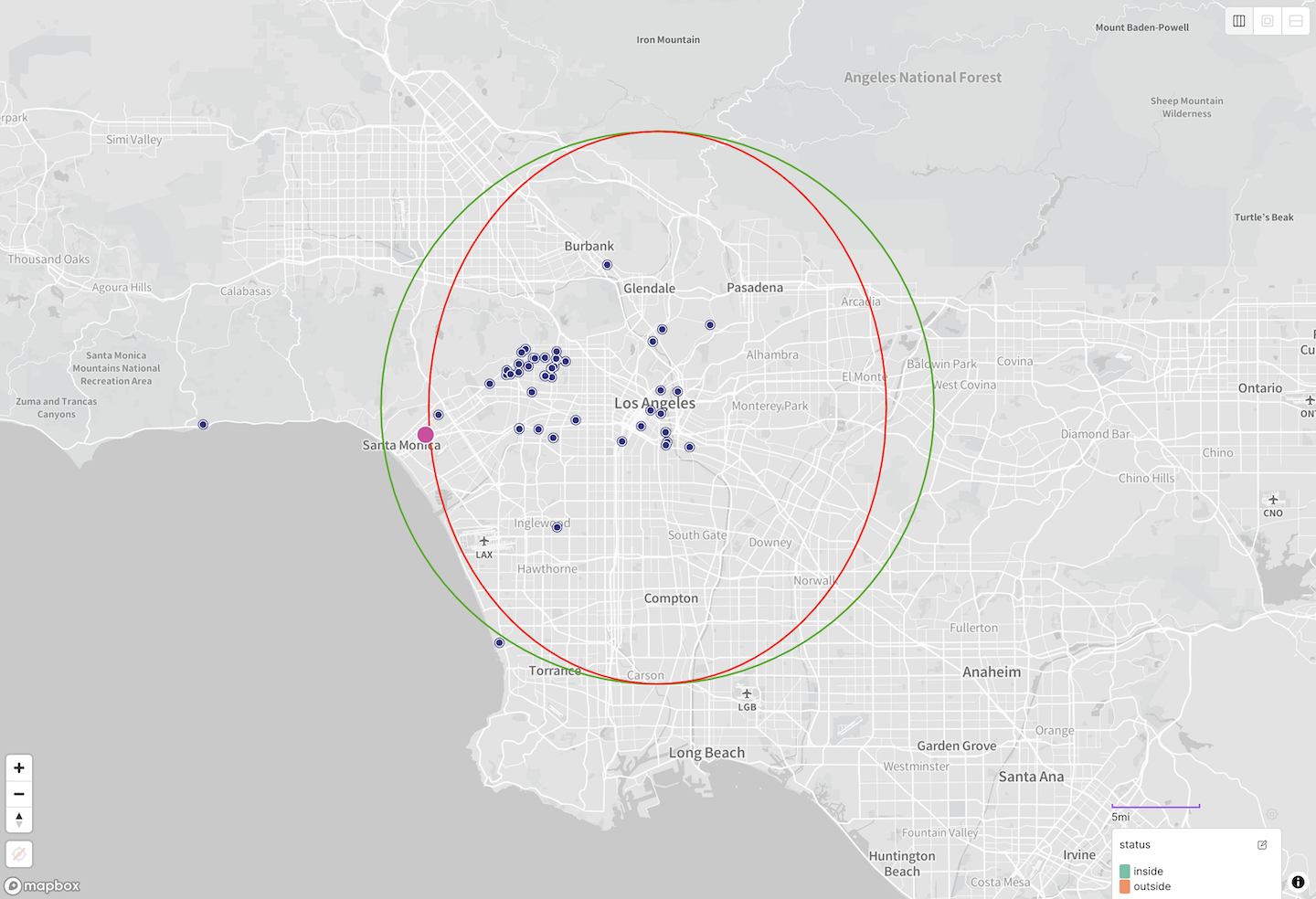
$geoWithin $center results vs. expected results.And our unfortunate partner was just outside the egg, thus being incorrectly omitted.
Fixing the query
Luckily the solution was simple.
As noted above MongoDB supports a second variant for radius queries using a
$centerSphere operator instead of the $center that we were using.
Per the
docs
for $centerSphere, this version…
defines a circle for a geospatial query that uses spherical geometry
In other words, this query effectively draws our circle on the three-dimensional globe rather than on the stretched and distorted two-dimensional map.
We just need to rewrite our query as follows:
// a $geoWithin $centerSphere query

db.events.find({
  coordinates: {
    $geoWithin: {
      // $center: [[-118.24, 34.05], 25 / 111.32],    /* BEFORE */
      $centerSphere: [[-118.24, 34.05], 25 / 6378.1] /* AFTER */,
    },
  },
})
There is a new conversion factor in play here, this time denoting that the
radius of the earth is approximately 6378.1 km. In this $centerSphere flavor
of the query we are working in unprojected
spherical coordinates,
measured in radians. Thus we need to
account for the size of the sphere that we are calculating upon.
We can re-run our test with this version of the query, and now we see that the results are finally in line with what we were expecting:
$geoWithin $centerSphere query around Los Angeles, evaluated against a grid of test points.Having updated our API to use this variant of the query, we solved the problem and returned our partner gallery to its rightful place in our listings, as shown by the pink highlight above.
That was the happy ending we were looking for.
A postscript on map distortion
But if you’re curious to learn a little more about map distortion, let’s dig a bit deeper into the nature of the problem that we were encountering.
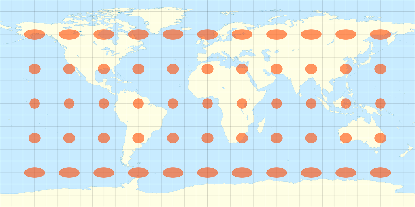
Returning to Placemark’s ability to draw different kinds of circles on the map, let’s now place a geographic circle on the map rather than a geodesic one. This one is computed in the simplest possible map projection — a geographic projection where we simply treat the longitude as the X coordinate and the latitude as the Y coordinate. (This projection goes by many names, such as “geographic”, “equirectangular”, “Plate Carrée” or even “unprojected”, which is not quite accurate.)
This corresponds to what you get when you use MongoDB’s $geoWithin $center
query on geospatial data:
As you can see, we get: a moderately oblong egg at the latitude of Los Angeles; a nice circle as we get close to the equator; and a very oblong egg as we approach the poles.
If you are wondering why you should trust my claims about the egginess of this two-dimensional image after I just said that all such maps are lies — good question!
It just so happens that nearly all web-based interactive maps, including Placemark, use a variation of the Mercator projection, the one you might remember from schoolroom maps. Mercator is a so-called “conformal” projection, meaning that its particular lie is to sacrifice area in favor of shape.
A shape drawn on a globe will be correctly maintained in a Mercator map, but the scale will vary across the map: true at the equator and very incorrect towards the poles. This is the reason for the common complaint that Mercator maps show Greenland as about the same size as Africa, when in fact Africa is about 14 times larger.
The amount and nature of the distortion introduced by map projections is such an important topic that cartographers have long relied on a clever technique for communicating this distortion visually, known as “Tissot’s indicatrix.”
To give you a sense of the kind of distortion we encountered with the $center
query, here is what Tissot’s indicatrix looks like for the geographic
projection. This shows essentially the inverse of the animation above — what
does a true circle plotted on the globe look like at various locations on this
map projection?
Now, imagine the inverse operation of this ⤴︎, drawing true circles on this planar space, in order to get a sense of how distorted your query results on a globe would be.
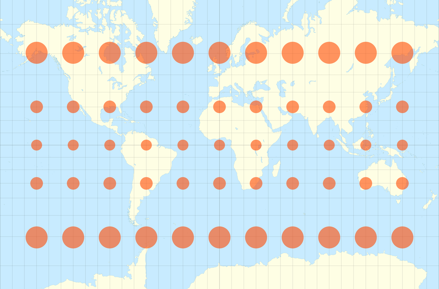
Finally, here is Tissot’s indicatrix for the Mercator projection, demonstrating its ability to preserve shapes at the expense of sizes.
An interesting recent development is that the web’s reliance on Mercator is changing, but only very slowly. Google began to make this change a few years ago, and Mapbox has written about their approach as well.
Hopefully this digression into the display of geospatial data has been illuminating. There is much more to say on this topic, since geospatial is more or less one asterisk after another. For example, we haven’t mentioned that the Mercator projection above is incapable of depicting the north or south poles at all! Nor have we touched on MongoDB’s various geospatial data formats, indexes, or the $near query and its spherical sibling the $nearSphere query, all worthy topics.
But we hope that understanding this crucial distinction between planar
($center) and spherical ($centerSphere) calculations will help you make the
right choice when devising your own radius queries with MongoDB or other
geospatial engines.