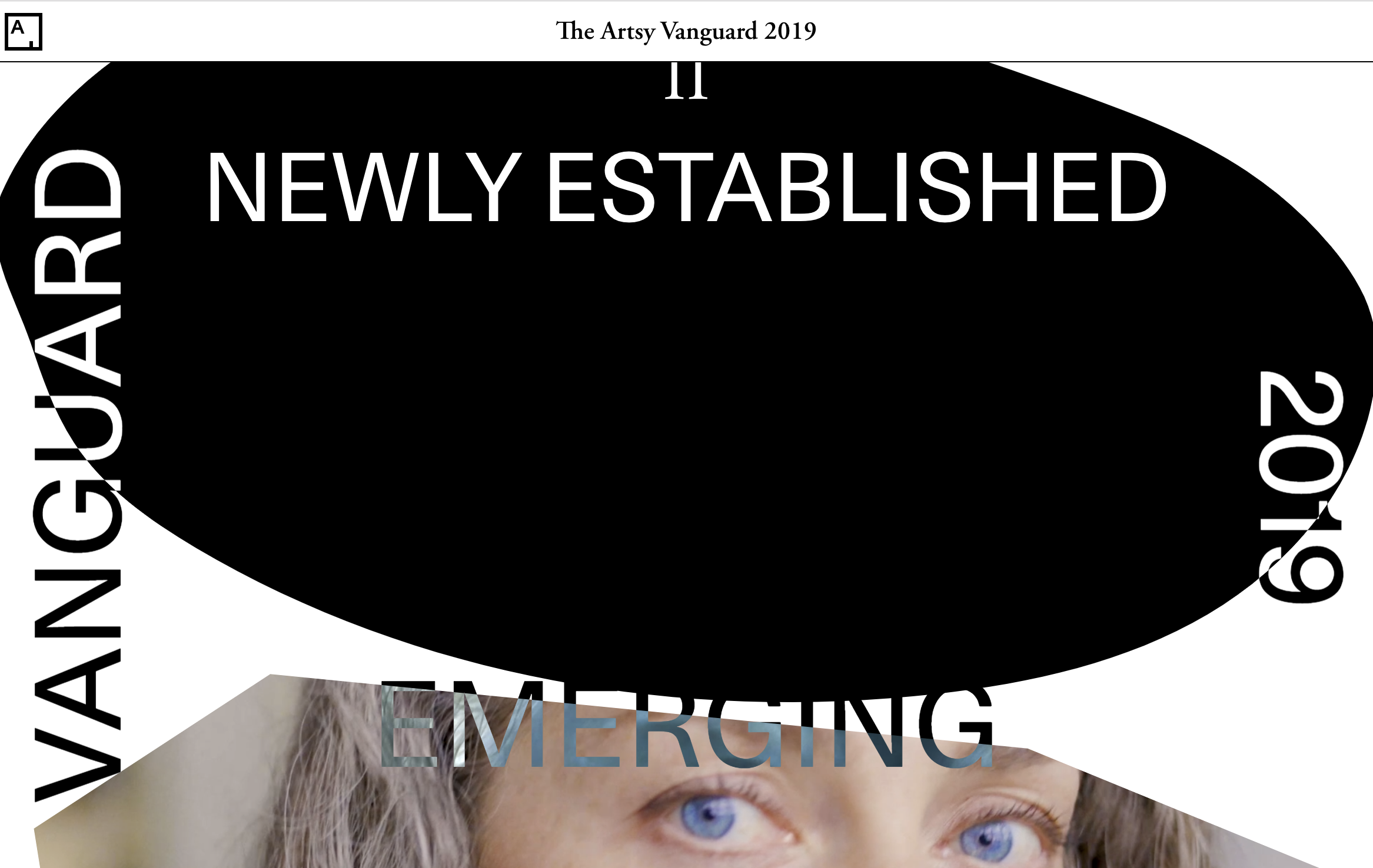
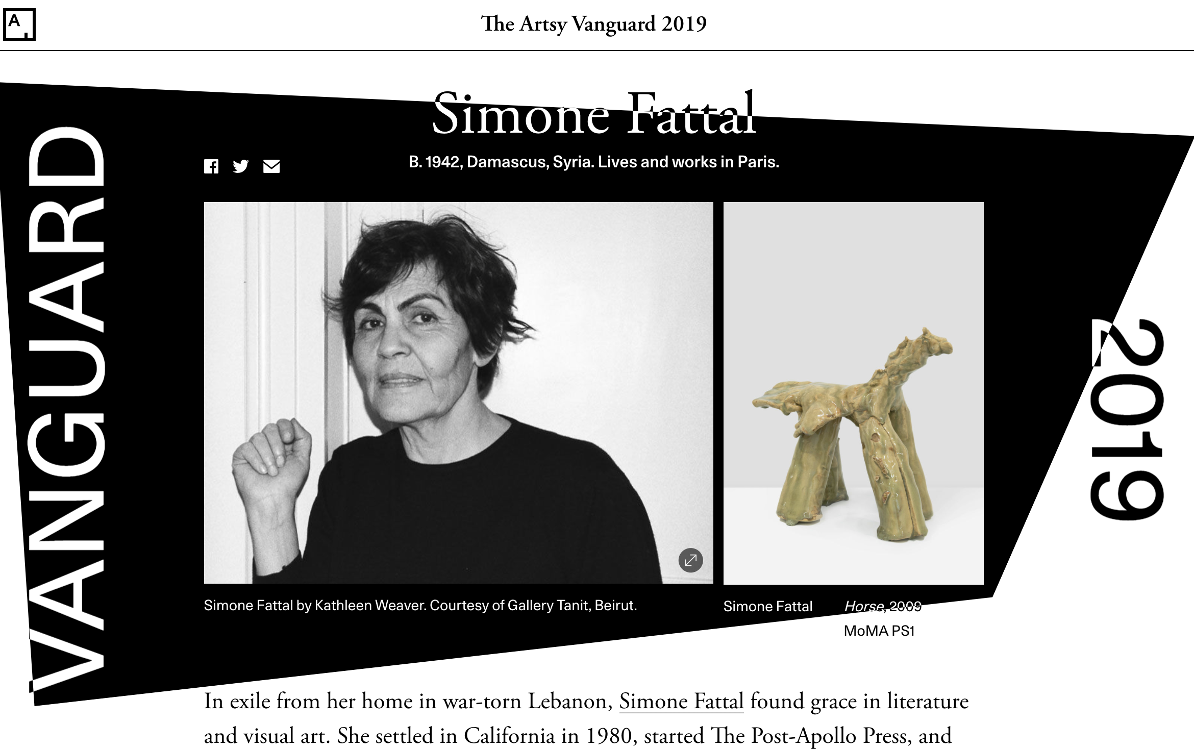
The Artsy Vanguard is an annual editorial series where we feature up-and-coming, notable, and praiseworthy artists and their contributions to the art world. 2019 was the second year that Artsy published this special feature, although we have been publishing custom editorial segments multiple times per year since 2015.
In this post, I’ll discuss my recent experience working on the 2019 Artsy Vanguard editorial feature. I’ll start by introducing the technology stack behind our articles and then discuss what I learned from both a team/organization and technical perspective.
An Introduction to Artsy Editorial
Typically our editorial works fall under one of five or so categories:
- Standard articles, which have the same layout, but whose content could broadly relate to any of the primary categories Artsy’s editors tend to cover.
- News content consisting of an infinitely scrolling feed of the latest newsworthy events in the art world.
- Sponsored and non-sponsored editorial features that may be a standalone publication or a part of a larger related series of features.
- Video editorial series.
For more information on Artsy’s editorals, check out this blog post written by Senior Software Engineer Eve Essex.
To maintain consistency and standardization in terms of user experience design, layout, and page interactivity options of the editorials that we offer, we use an internal content management service. Artsy Writer enables our editorial team to publish content to the main Artsy website without having to collaborate with our engineering organization. (Yay software!) Given that it is designed to handle the layout of the different types of editorial features that we offer in a uniform way, highly customized editorials like the 2019 Artsy Vanguard or 2018 Year in Visual Culture require quite a bit of planning and cross-team collaboration, as well as customized software development to support the features that deviate from our current layouts.
Creating the 2019 Artsy Vanguard was truly a company-wide effort! I’m pretty new to Artsy, having only joined last summer, so some of the work I did on Artsy Vanguard was around understanding our existing framework for routing article content from Positron, Artsy’s editorial API, to Force, the code that powers our production site. On the Engineering side, I collaborated with the project’s technical lead Eve, a senior engineer with years of experience working in these code repositories. There were several key stakeholders, including, but certainly not limited to, a lead project manager, lead visuals editor, designers, content writers, as well as the external design firm that delivered the initial design concept and video content used for the series.
Learnings
Vanguard was an exciting project, but as with any software endeavor, it came with its own share of learnings and difficulties.
1. Splitting time between two teams is hard
My team, Grow, is responsible for the development and maintenance of Engineering software related to increasing user engagement with Artsy’s products. Some of our most notable projects include City Guide, an iOS feature built in collaboration with BMW, detailing art shows and partner fairs in several major international cities, collections and collection hubs offering prospective art buyers more comprehensive ways to explore works and artists of interest, and of course the Artsy Editorial, home to all of our editorial content. We typically work in two-week sprint cycles, aiming to produce a planned set of deliverables during that time, and collaborating between other developers on the team, a designer, product manager, data scientist, and technical team leader.
Given that this project involved collaboration from several teams and stakeholders outside of Engineering, we decided to manage it as a project separate from the rest of the deliverables the Grow team did during the sprints. This meant I had to split my time between team meetings for Vanguard work and team meetings for Grow. I would keep the Grow team up to date on the Vanguard work we were doing but it felt like I was in a liminal space between the two teams. In addition to attending weekly cross-team Vanguard standups, I attended daily Vanguard engineering standups to align with Eve on the work that we needed to produce. In the interest of protecting my time and not attending 3 different team standups in a single day, I posted updates to the Grow team via Slack to keep everyone updated on the progress of our work. Despite our best intentions, it’s difficult to work on two teams at once and feel fully committed to either.
2. Estimation is Hard
Due to the way this project was organized, we allotted 1.5 sprint cycles to complete the engineering work. However, this time allotment was decided on before we had received the completed design specifications from the design firm. This posed a set of interesting challenges in the sense that the Grow team committed to delivering a feature by a predetermined deadline without having all of the information needed to understand the full scope of the project. As with any engineering project, there are often unknown unknowns, those pesky little gotchas that surface as work commences on a project, but that cannot always be predicted. This presented an interesting lesson in learning how to estimate the amount of work required to deliver a minimum viable product and reduce the scope to meet certain deadlines.
Given the limited amount of time to deliver some fairly complex designs, it was clear that we would have to reduce some of the technical complexity in order to meet the deadline. This is pretty standard in agile development, but this was the first time that I was in a position of having to deliver this “bad news”. It is difficult to tell team members that a feature is not going to be able to shipped as initially expected, but these are the sort of concessions that have to be made sometimes in order to deliver a viable product. Fortunately, I was fully supported by my managers, tech lead, and colleagues in having to deliver the news that we were not going to be able to deliver a feature identical to the one given to us by the design firm. From this experience, I learned that making accurate estimations about how much work a project actually involves is hard, relying on agile as a rule makes it easier, communicating early and often when there’s any uncertainty around delivering a feature by deadline is critical, and working with team members that value candor, flexibility, communication, and iteration is empowering.
3. CSS is Hard
I get excited about implementing visually delightful designs, and Artsy Vanguard’s 2019 designs did not disappoint. There were two key components that involved interesting CSS approaches:
** 1. Mixed Blending Mode to handle the inversion of the side frame text when it appeared over different backgrounds**
** 2. Creating the visual effect of .mp4 videos nested inside of SVG shapes**
Mixed Blend Mode
Mixed blend mode is a CSS property that handles blending the colors of overlapping elements. In this case, we wanted to create the effect of inverting the colors of the static side frame text when they overlapped with either the white background, the black SVG shapes, or the SVG videos.
This inverted color effect also needed to be applied to the text of the editorial content when it overlapped with the black SVG background, when it extended past the SVG background onto a white background, and when the current article was in an expanded state.
I found CSS-Tricks and the Mozilla Developer’s Network documentation super helpful in understanding the various blending properties. Since the designs for Vanguard involved a fairly simple blending mode of inverting black and white, the mix-blend-mode difference property was how we created the effect of inverting the black text against the various backgrounds it overlapped with. The blend mode property works by calculating the rgb color value of the text, and the background-color of the underlying element, and using that value to determine what colors to render. This inverse calculation also creates the “solarized” effect when the black side frame text renders over the video-in-SVG.
In the original design specifications, the static text framing the page was intended to render black over a white
background, white over a black background, and white over the video-in-SVG. In order to achieve that effect, we
would have needed to apply the difference mix-blend-mode property when the text overlapped with a black or white
background, and color-dodge when it overlapped with a video-in-SVG background. However, given it is not possible to
assign multiple blending modes to a fixed element we had to deviate from the original design specifications.

const FrameText = styled(Sans)`
  position: fixed;
  z-index: 2;
  mix-blend-mode: difference;
  color: rgb(255, 255, 255);
`
const InvertedText = styled(Serif)`
mix-blend-mode: \${p => (p.isMobile ? "normal" : "difference")};
color: rgb(255,255,255);
will-change: color;
`
Video-in-SVG
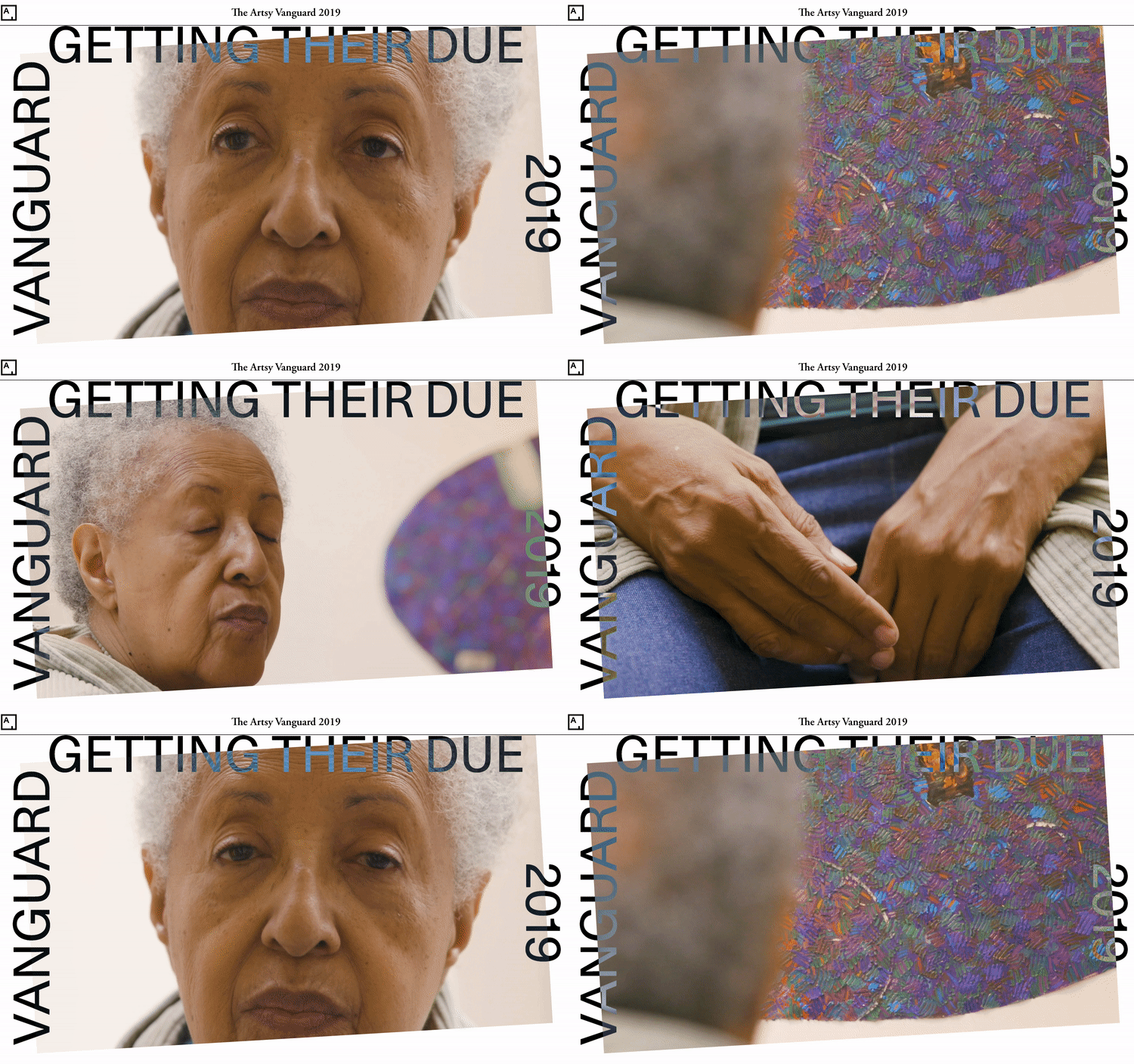
In the article series you might have noticed that each of the article subsections begins with a different polygonal shape, which serves as a visual indicator to readers that they are viewing an article either the Emerging, Newly Established, or Getting Their Due sections. You might have also noticed that each article subseries starts with a video clip nested inside of one of these corresponding polygon shapes. These are what I refer to as video-in-SVG. Nothing too in-depth here, but I’ll offer up the initial approach to how this effect was implemented as well as the final solution.


Initially, I attempted to implement this using the Foreign Object SVG element and adding a Clip Path CSS property with the to the div element wrapping the video. In both approaches the video component stopped respecting the responsiveness of the page, which created an undesirable layout effect of having a huge video on screens smaller than 600 pixels wide, and disproportionate sizing relative to the rest of the components in the article series.
In order to achieve the desired effect, the component was refactored to make the SVG “blob” a sibling of the video wrapped inside a parent div with a fixed height. The parent div received a height equal to 100% of the viewport width divided by the video’s aspect ratio–16:9. This prevents the video from being visible outside the borders of the SVG. Et voila!
const SubseriesWrapper = styled(Flex)`
  flex-direction: row;
  position: relative;
  z-index: -2;
  /* 16 x 9 aspect ratio */
  height: calc(100vw * 0.56);
`
<SubseriesWrapper>
  <SubseriesSVGWrapper>
    <svg viewBox="0 0 1600 900" xmlns="http://www.w3.org/2000/svg" fill="FFF" width="100vw">
      <path d="M0,0V900H1600V0ZM1489.83,896.43,146.61,805.5,47.2,182.84,320,4.17l874.07,86,360.06,148Z" />
    </svg>
    <VanguardSubseriesVideoWrapper>
      <VanguardSubseriesVideo autoPlay loop muted playsInline controls="{false}" src="{props.url}" />
    </VanguardSubseriesVideoWrapper>
  </SubseriesSVGWrapper>
</SubseriesWrapper>
Final Thoughts
One of the biggest non-technical takeaways for me was the importance of becoming skilled at thinking like a product manager while approaching engineering work. Engineers that do this well are adept at balancing many responsibilities–scoping out the amount of engineering work involved in producing a deliverable, communicating technical information to non-technical team members, managing expectations and (sometimes) competing interests when working on cross-teams projects, gracefully informing stakeholders that the scope of a project will have to be limited in order to deliver an MVP, among others. Doing these things well is hard, and furthermore not something we learn in computer science or engineering programs; yet is a requisite, in my opinion, to be an effective engineer. I’m grateful for the opportunity to have collaborated with others on this year’s Artsy Vanguard and to have been given the chance to develop these skills.