During Artsy’s recent 2017 Hackathon we tackled making all of our editorial content accessible. The idea was hatched at Berlin JSConf this spring, where Laura Carvajal gave a talk following the Financial Times’ experience implementing better accessibility requirements, and how they built these considerations into their testing process.
What does accessibility mean in a browser? Generally the term refers to supporting the wide range of assistive technologies for users with vision or motor impairments. These include screen readers, as well as mouseless navigation using a keyboard, eye tracking and other devices. Interestingly these technologies are implemented at the OS level rather than the browser itself. Mac’s OS includes a built in screen-reader, and JAWS is the most popular application in this vein. It is also notable that browsers do not track users who employ assistive tools.
Two users on WebAIM’s forum excellently present the case for accessibility as a developer’s responsibility:
“Users may be highly resistant to having their disabilities identified as they go throughout the web. Most persons with disabilities would really just rather that the Web just work for them.”
“Looking at accessibility as a way to serve a specific population is missing the point that accessibility is about inclusion of all people.”
A central tenant of Artsy’s mission is to ‘make art as accessible as music’. By expanding accessibility for the visually and motor impaired to writing on art and culture, this projects allows us to follow through on this statement in a very literal way. Furthermore, there’s no reason to ignore this audience; accommodating use of assistive technologies is an ethically responsible thing to do.
Putting it into practice
Smartly structured HTML is essential for screen readers. They take note of semantic elements like headings or <nav>, and interpret our page’s elements in the order they are written. Absolute and fixed spacing are ignored in this context, so it is important to realize non-visual reading of your site may prioritize different information, or present it in a different order than expected. This means that in JavaScript-oriented environments, and anywhere elements are inserted on the client, it is important to keep all elements necessary to navigating available in a semantic form at all times, including drop downs.
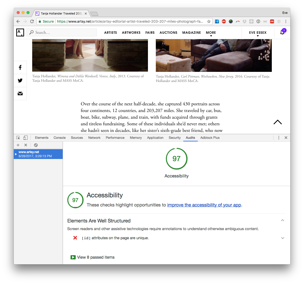
We used three tools to evaluate pain points on our site: the npm module pa11y, Chrome’s Accessibility Developer Tools, and WAVE— a web accessibility evaluation tool by WebAIM, a non-profit dedicated to “empowering organizations to make their own content accessible”. All three work similarly. Input a web address, and an error report is generated. Pa11y works in the terminal, and can export to a CSV, and even create a dashboard tracking separate URLs. Chrome handily provides a color-coded scorecard in addition to an accessibility audit report. Because Chrome’s reporting lives in the browser’s console, it is especially easy to inspect your code directly from an error. However, each tool brought up unique issues, so it is prudent to try a few.
We found a range of warnings and errors on our first run, where Chrome gave us a failing grade of 62, and pa11y raked up 48 errors, not counting a sizeable number of warnings. Luckily, most of the changes were fast and easy:
- Use meta language property (
<html lang="en">) - Increase the meta property for maximum scale to 5
- Add hidden text to icon-only links and UI elements
- Add alt text to all images
- Include aria form attributes on input fields
- Use semantic roles for the article body (
<div role='article'>) - Remove of duplicate IDs from pages
- Remove vendor-generated ids from SVGs, which in our case were often duplicates.
A summary of changes implemented can be seen in pull requests here and here.
There were several places on our site where we wanted to include text that was intended only for screen readers. However, display: none is not necessarily acceptable in this context. Instead we opted for absolute positing of screen-reader targeted elements far out of the screen.
// hides text that is only for screen-readers

.screen-reader-text {
  position: absolute;
  left: 10000px;
  top: auto;
  width: 1px;
  height: 1px;
  overflow: hidden;
}
A few challenges were encountered as we worked through the error reports. My research brought up mixed messages on display: none. For example, Artsy renders the main menu in both desktop and mobile versions, but hides one view based on the user agent. We saw errors with all testing frameworks for having duplicate IDs, despite the fact that these elements were hidden via display: none. This is a problem that would be well solved with React, where we could render content based to screen width rather than hiding a duplicate.

Another road block encountered was for headers that contain links— which the error reports recognized as empty headers, rather than reading the link. We use linked headings frequently for section titles in our articles, so this is an issue we are still mitigating. Lastly, using a screen reader is a skill set all its own! While our Chrome audit score is now far higher than where we started, my own experience using a screen reader proved far more difficult than expected. To be completely sure our implementation is working, I hope to find an experienced screen-reader user to give it a spin.