Artsy’s end of year features are an annual chance to walk through highlights of the year while also exploring front-end experiments. Created in collaboration with UBS and designed by Owen Dodd, The Year In Art 2016 presents an interactive timeline of singular moments in art and culture over the past year.

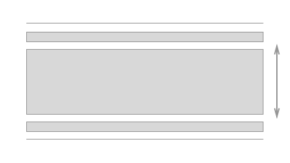
The piece opens with header animation, a series of transparent sliding boxes that presented a unique challenge. The finalized look is somewhat like a slinky- a stack of containers that are stretched open from the bottom, and compress again as they reach the top of the viewport, collapsing inward without ever crossing outside the screen.
Achieving this effect required animating elements in response both to the size of other elements in the viewport, and to the client’s scroll interactions, all while sitting transparently over a video background.
Because each element in the animation opens out from the center, and because the entire container is transparent, the sections needed to adjust their height rather than simply sliding out of view. Furthermore, the entire animation needed to be responsive, and able to adjust it’s place easily on page when refreshing or resized.
Essentially we needed a way to know where in our scroll position the top of each section ‘enters’ the window, which is also the point at which it should become visible. This functionality is close to Waypoints, a library we use often at Artsy, but that option wasn’t going to work in this case. Because each section was actually in the viewport already, just at 0px tall, the library wouldn’t recognize an element’s ‘entering’ the frame (because it’s already there).

The sections we would be animating were a known element- we had 10 pieces of content with a target height of 33% of the container. Additionally, a title card would be included at a different dimension, 100% container height.
So how can we establish when each element should be visible?
First we can declare the expected heights for each section:
setupSliderHeight: =>
   #height of bounding container (and title section)
   @containerHeight = @windowHeight - @headerHeight

   #height of a single open section
   @activeHeight = @windowHeight - @headerHeight - (@windowHeight * .33)
Next, we need to find at what scroll position each element should appear. Using the getScrollZones method below, we are able to return an array of ‘zones’ corresponding to the top each section.
getScrollZones: (sections)  =>
    scrollZones = []
    scrollZones.push @containerHeight  #title section
    for i in sections
      scrollZones.push( ( (i + 1) * @activeHeight) + @containerHeight + 20)
    return scrollZones
getScrollZones returns an array from which we are also able to deduce another important variable, the height of the entire container if each section were ‘active’ or open:
@openHeight = @getScrollZones().last + @headerHeight
Our container is a fixed position box, but to simulate scrolling, we can put it inside another container whose height corresponds to @openHeight, allowing us to scroll the full length or our ‘scrollZones’ without any visible change on screen.
Now that we’re able to scroll, how do we know where we are? This calls for another method, called as the user scrolls, to constantly let us know which element in our animation should be active.
 closestSection: (scrollTop, scrollZones) =>
    closest = Math.max.apply(null, scrollZones)
    for i in [0..(scrollZones.length - 1)]
      if scrollZones[i] >= scrollTop and scrollZones[i] < closest
        closest = i
    return closest
This method gives us the index of the section nearest to the top of our window at any given moment, allowing us to identify and manipulate both the active element and the ones immediately surrounding it. Check out the full implementation of this project on GitHub.
Additionally, be sure to check out previous features created by Artsy in collaboration with UBS: