Email can be one of the most powerful ways to engage with your users, and can serve a multitude of purposes. It can be used as a way to highlight selected content (weekly/monthly newsletters, ‘year in review’, etc.), provide a service to users (analytics breakdown of visits to your profile/favorites page), or re-engage with users (new feature announcements, etc.). Here at Artsy we use all of these kinds of emails and have found them to be a very valuable asset. However, best practices for template layout and CSS (keeping in mind the variety of devices and screen sizes that your users have) are quite different from, and very far behind, the current HTML5 standards and practices for making beautiful web pages. In this article, I’d like to present some techniques I’ve successfully used at Artsy to create emails that look good on your browser or mobile device, in some of the most popular email clients out there.
The Main Difference Between Email and Web
A fundamental difference between email and web, and which essentially accounts for the completely different methodology and rules you should follow for emails, is that of the rendering client. In 2014, (assuming you are not supporting certain legacy versions of Internet Explorer and other old versions), browsers for the most part will render passed in HTML and CSS in a standard fashion. While there are some notable exceptions still, graceful degradation is quite possible. That is because the only ‘interpreter’ of your HTML is the end user’s browser, which operates under a certain set of known rules. With emails however, the interpreter is the end user’s mail client of choice, which can be: native iOS apps, web apps, and even standalone desktop applications. All of these do their own parsing/interpreting before rendering, which can cause HTML that results in a nice looking web page to look totally broken in an email, as well as the same exact email looking remarkably different across mail clients. One of the main reasons why email clients do this is to remove things that might interfere with the rendering of the mail client itself, or any security risks.
Also of note is that the use of Javascript within an email is of course, not possible. Additionally, the HTML that will be emailed to your users needs to be sent as one file with inlined CSS. You can use a tool like premailer to allow you to develop your CSS separately and then convert to an inline style.
Some Basics about Tables
Yes, it’s 2014, and yes, we’re going to talk about tables on an engineering blog. That’s because for emails, tables are going to be your main tool to position and lay out your content. Two of the most common CSS selectors (position and display) are bad ideas to use in email. They are mostly unsupported by mail clients (which will reach in and rewrite your HTML/CSS) and will lead to unexpected looking output. However, you can achieve virtually any layout desired using tables.
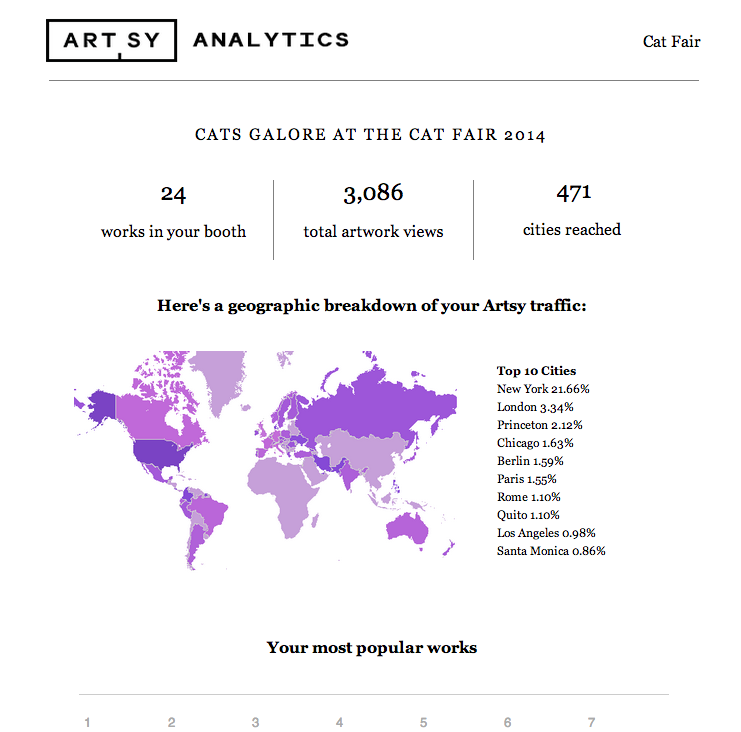
Here is sample HTML that generates the top part of the email shown above. While it may make your eyes bleed from the table use, notice we are able to achieve the beginnings of a basic 3-column layout, with equal-width columns and centered headers/text with no position-related CSS.
<table border='0' cellpadding='0' cellspacing='0' style='margin: 0 20px; table-layout: fixed;' width='600px'>
  <tr>
    <td align='center' colspan='3' style='padding: 0px 0px 15px' valign='middle'>
      <font color='black' style='font-family: Georgia, serif;font-size: 16px; line-height: 1.3em; letter-spacing:2px;text-transform:uppercase;'>
        Cats Galore at the Cat Art Fair 2014
      </font>
    </td>
  </tr>
  <tr>
    <td align='left' style='padding: 0px 0px 15px; border-right: 1px solid grey;' valign='middle'>
      <font color='black' style='font-family: Georgia, serif;font-size: 16px; line-height: 1.3em;'>
        <div style='text-align: center; font-size: 23px;'>
          24
        </div>
        <div style='text-align: center;'>
          works
          in your booth
        </div>
      </font>
    </td>
    <td align='middle' style='padding: 0px 0px 15px; border-right: 1px solid grey;' valign='middle'>
      <font color='black' style='font-family: Georgia, serif;font-size: 16px; line-height: 1.3em;'>
        <div style='text-align: center; font-size: 23px;'>
          3,086
      	</div>
        <div style='text-align: center;'>
          total artwork views
        </div>
      </font>
    </td>
    <td align='right' valign='middle'>
    <font color='black' style='font-family: Georgia, serif;font-size: 16px; line-height: 1.3em;'>
      <div style='text-align: center; font-size: 23px;'>
        471
      </div>
      <div style='text-align: center;'>
        cities reached
      </div>
    </font>
    </td>
  </tr>
  <!-- more content below -->
</table>
Now under this we present a heatmap and table of top views by city. For that we use the same 3-column table, except specify a colspan of 2 on the column that contains the heatmap. That is because we would like that column to take up a width equal to the first 2 columns of the equally spaced three at the top, and the table of top views will take up the last column. Here’s that markup:
	<tr>
    <td align='left' colspan='2' style='padding: 0px 0px 15pxl; width: 66%;' valign='middle'>
      <div>
        <img src='link_to_heatmap.png' width='400px'>
      </div>
    </td>
    <td align='right' style='padding: 0px 23px 15px; width: 33%; text-align:left;' valign='middle'>
      <font color='black' style='font-family: Georgia, serif;font-size: 12px; line-height: 1.3em; font-weight:bold;'>
        Top 10 Cities
      </font>
      <font color='black' style='font-family: Georgia, serif;font-size: 12px; line-height: 1.3em;'>
        New York
        21.66%
        <br>
        London
        3.34%
        <br>
        <!-- 'br' separated string of views -->
      </font>
    </td>
  </tr>
Notice that again we are using no position or display related CSS. However, now our table has a 3 column section and a 2 column section, and we are well on our way to creating a nice email! I kept these as separate rows in the same table, but could have equivalently had each of them be their own table with no ill effects and almost the same markup. Depending on your design and layout, you may need to have multiple tables (nested and not) to support different widths and column layouts, however they should all just work.
Background Images and Overlayed Text
Ok, so tables are all well and good and you can achieve a lot using them, and without having to use any display or position CSS. But what if you want to overlay text on an image? (or even another image over an image)? On a web page, there are many ways to accomplish that, but they all use CSS that you really should not be using in emails (namely: position, display, top, right, bottom, left, and most layout properties besides padding. Also, no negative padding please!). But no worries, because you can still accomplish that using background images!
Here is an example from our current welcome mail to users:
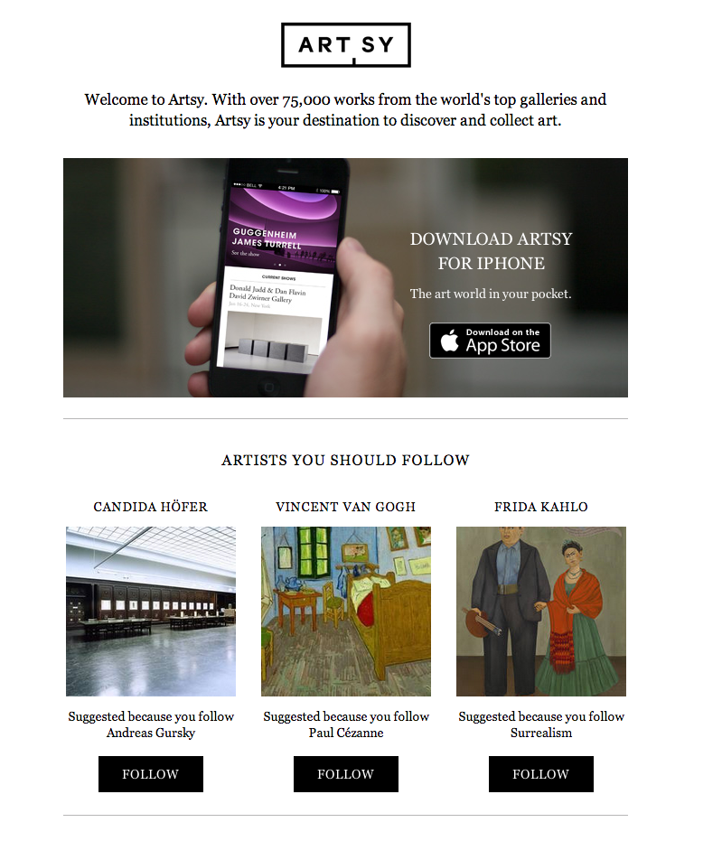
The top part (the iPhone pic) is actually two images (the picture, and the App Store logo), as well as some text overlayed on top. Here is the HTML to accomplish that:
<table cellpadding='0' cellspacing='0' id='iphone-table' style='border: 0;padding:10px 0px 15px 0px;width:625px' width='625'>
<tr>
<td align='left' valign='middle'>
<table background='link_to_phone.png' cellpadding='0' cellspacing='0' height='265' style='height:265px;width:625px' width='625'>
<tr>
<td style='padding-top:57px;padding-right:53px;padding-left:375px;text-align:center;'>
<div style='line-height:26px;'>
<font style='text-transform: uppercase; font-size: 19px; font-family: Georgia, serif; color: white;-webkit-font-smoothing:antialiased;'>
Download Artsy for iPhone
</font>
</div>
<div style='padding-top:10px;'>
<font style='font-size: 14px; font-family: Georgia, serif; color: white;-webkit-font-smoothing:antialiased;'>
The art world in your pocket.
</font>
</div>
</td>
</tr>
<tr>
<td align='right' style='padding-right:82px;vertical-align:top;'>
<a href='https://itunes.apple.com/us/app/artsy-art-world-in-your-pocket/id703796080?ls=1&mt=8'>
<img src='app_store.png' style='border: none; outline: none; vertical-align:top;' width='140px'>
</a>
</td>
</tr>
</table>
</td>
</tr>
</table>
I chose to use a separate table to hold this content, where the background image for this table is the picture of the iPhone in hand. That table (with a background of the photo) has two rows, each with one column. The first row which is for the top part of the image, contains the ‘Download’ white text. That is positioned within the column through padding, which is well supported by most mail clients (as long as it’s positive padding that is!) The second row, for the bottom part of the image, is a picture of the ‘Download on the App Store’ logo, and we chose to put that in an anchor tag and link to the App Store. You could have alternatively made this image a background as well to achieve the same overlay effect, as well as added more overlaid text, etc.
Essentially, to overlay text on images, and images on images - your only option in email is to use background images.
Mobile Responsiveness
Ok, at this point we know how to craft some ‘dynamic’ layouts, (multi-column, sidebar, etc) and can overlay text and images for added effect. Now let’s think about how this should work/look on a mobile device. Media queries will be our tool of choice here (well supported by mobile mail clients, with a notable exception being the Gmail iOS app.)
Something to keep in mind, depending on your use case, is to potentially design the email in the first place with mobile in mind. This can mean larger font sizes across the layout, as well as a single or two column layout max for your content. Since you have much less screen space to work with on mobile, the media queries we are going to use will largely be to increase font sizes, as well as using ‘width’ and ‘float’ to force a two column layout into one column (as an example). Depending on the mail design, this can be simple to do, or quite tricky. It’s worth considering this in your initial designs.
Now the first thing to do is to include the following meta tag in your HTML:
<meta name='viewport' content='width=device-width, initial-scale=1.0'>
This will tell the browser to treat the viewport size as the size of the device that is being used. This combined with media queries will enable us to create mobile emails.
As an example, consider the following two images. The first is the desktop version of the top part of a personalized weekly mail (blog post on how we efficiently generate these to come!), and the second is the mobile version of that same mail.
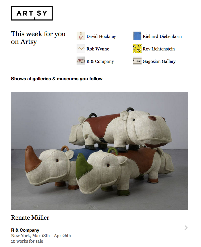
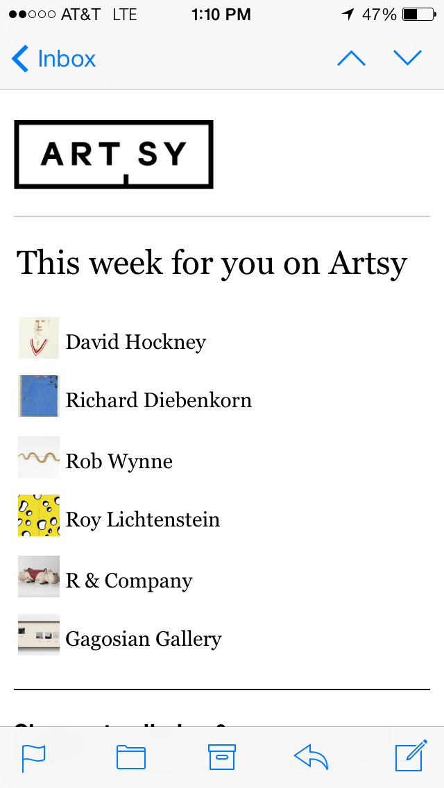
The markup for this is pretty vanilla (similar to above, 3 column layout in a table). For mobile, we want to left-align everything and trim things down to one column. Of note here is that we are truncating text with ellipsis in the desktop version, and when the content reflows to one column we actually have more room to reveal the text (but still keeping truncation in just in case), so we have to enclose the text in a div (must have a block element for truncation)
Here is how we truncate text:
  <div id='row-to-expand' style='white-space:nowrap;overflow:hidden;text-overflow:ellipsis;width:150px;'>
    Some really long text that will get truncated
  </div>
We specify a width on a block-level element and then use the ellipsis trick. Here’s another screenshot of the truncation in action:
Our first media query can be something like:
  @media (max-device-width: 320px){
    div[id='row-to-expand']{
      width: 260px !important;
    }
  }
We’ve set the breakpoint at 320px (vertical layout on an iPhone), and at widths less than or equal to that, this rule will kick in. Note the ‘!important’ at the end (all of our media queries will have that to allow them to override the existing inline CSS). This is enough to expand that div and reveal more text.
Here’s the media queries for the rest of this section that transforms the three column layout into one:
  @media (max-device-width: 320px){
    td[id='summary-col']{
      float: left !important;
    }
    td[id='summary-header']{
      float: right !important;
      width: 300px !important;
    }
    td[id='nested-summary-col']{
      width: 300px !important;
      float: left !important;
      padding: 0px !important;
    }
    table[id='summary']{
      width: 300px !important;
    }
  }
where the td[id='nested-summary-col'] are the tds that hold the thumbnail and artist or gallery name.
Essentially all we are doing is changing the width of the container/parent table to 300px, and then making the width of each td 300px and adding a float. This will force your table to now be a one column layout- easy!
Some misc. email tweaks
Sometimes it becomes necessary to hide/show certain things for mobile or desktop. This can be a bit tricky due to not being able to use display:none; , so here are a few things I’ve found that worked:
width: 0px;(works for hiding images)line-height: 0px;(works for hiding text)font-size: 0px;(works for hiding text)
Another thing you might encounter is that text links automatically become blue in email. This is because many mail clients will take an un-styled or black link text and make them a default blue color. An easy hack to get around this is to explicitly color your links something like ‘#000001’. This ‘almost-black’ will be left untouched by mail clients, yet is close enough to black that the naked eye can’t perceive the difference.
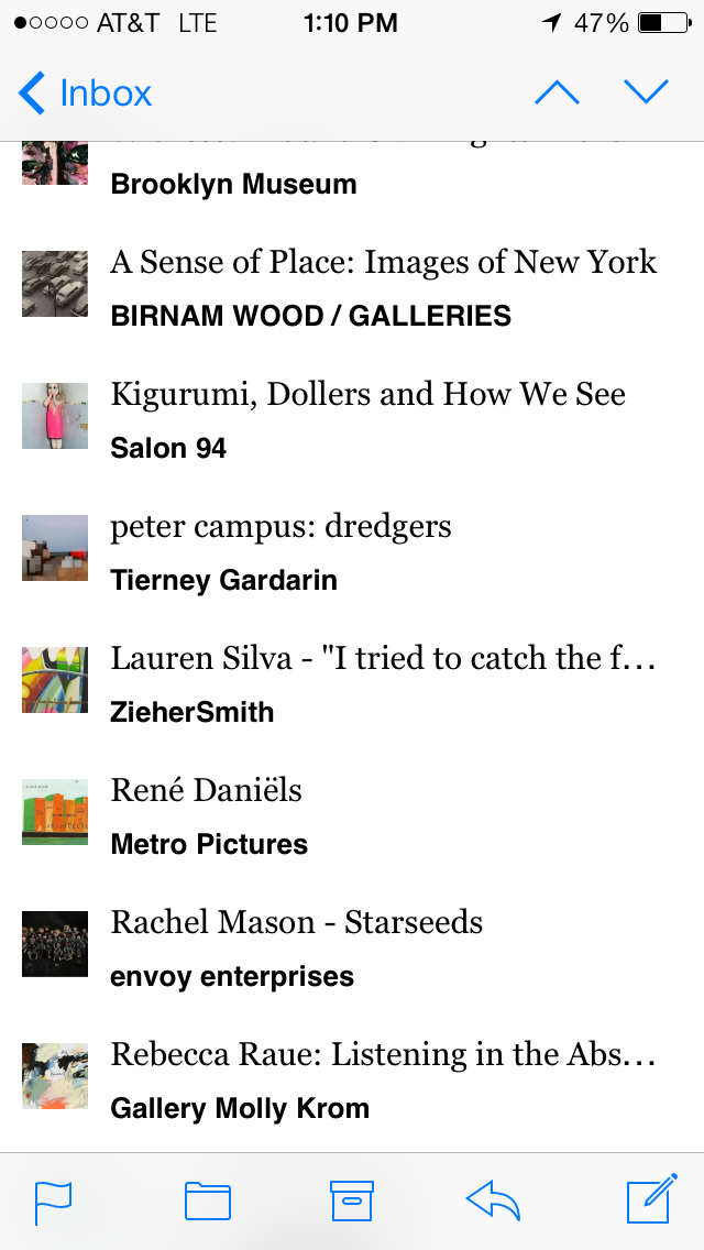
Here’s a screenshot of an isotope or Pinterest column style layout, with truncation of text, and resized for mobile (running the full gamut of tricks):
Here is a gist I use to prepare artworks for a columnar display like this. You pass in a collection of artworks (where each artwork is arbitrarily sized), and the number of columns and width of the desired output. It will return the artworks grouped into columns that can be directly rendered in an email, while respecting aspect ratios and ensuring the columns are of approximately equal height - resulting in a dynamic feeling layout. For this email, we group this set of artworks into 2 coumns, with each column having a width of 300px (for desktop).
Great tools to use:
- Premailer This will enable you to develop CSS in a sane (ie- not inline) way, and then at generation/compile time, inline it for you.
- Litmus Using Litmus’s VM’s with different OS’s and mail clients, you can preview how a sample email will look among all sorts of different configurations. I recommend figuring out what mail clients/browsers/OS’s you want to target and making sure you test all your emails here.
- Haml (or any templating language of choice). A lot of the blocks of content in our mails are dynamically generated, and Haml’s conditionals and looping syntax, as well as Ruby-style string evaluation has proven invaluable.
That’s all for now! With a lot of trial and error, I’ve built up a toolbelt of tricks, techniques and hacks I’ve been using to develop responsive and pretty emails quickly. I think of the limited set of tools at my disposal as a puzzle with which you can still create great looking and responsive layouts to feature your content. Previewing mails using Inbox Inspector have enabled me to craft, deploy, and send them to our users with confidence. Post any comments or tips of your own here, and follow us on Github!
Comments